WooCommerce Checklist: Use This 63-Point Guide To Increase Store Sales [2020 Update]

 If you’re looking for opportunities to optimize your store, this is the bare-it-all WooCommerce checklist you always needed!
It’s simple but it’s also very detailed. Treat this like your eCommerce go-live checklist, but don’t just read it. Run your store through each every point.
That’s how you’ll uncover the hidden opportunities and will be able to plug the leaks. So grab your favorite drink and open your store on a separate tab.
Let’s begin.
Contents
- Homepage Optimization
- 1. Do You Have a High-resolution Banner Image With Clear Messaging And Call To Action?
- 2. Do You Offer Options In Your Navigation Menu To Help People Navigate?
- 3. Is Your Unique Selling Proposition Well-Articulated And Clear?
- 4. Is Your Home Page Keyword Rich With At least 500-700 Words Of Content?
- 5. Do You Highlight Social Proof On Your Homepage?
- 6. Do You Highlight The Free Shipping Threshold On The Sticky Header?
- 7. Is Your Helpline Number Displayed Above The Navigation Bar?
- 8. Do you have credibility boosters such as ‘As seen on,’ ‘Mentioned in’ on your home page?
- 9. Do You Have A Short, Trust-Boosting ‘About’ Section On Your Home Page?
- 10. Have you highlighted all your payment options with their logos in the footer?
- 11. Do you display social icons for like/ follow and newsletter sign-up options in the footer?
- 12. Have you given links to privacy policy, refund policy, international orders page (if applicable)?
- Category Listing Page
- 13. Do you show tags such as ‘new’, ‘best seller’ etc. on the category listing page?
- 14. Do you have an option for dynamic filtering on the category page?
- 15. Do you direct people straight to the product page from category page instead of opening up a pop-up for a quick view?
- 16. Do you have a description of every category written on the top of its category page?
- High-Converting Product Page
- 17. Is your product page distraction-free?
- 18. Are your product images high-resolution and shot from different angles?
- 19. Are your product descriptions well-formatted and easy to read?
- 20. Do you tell your shoppers how best they can use your products?
- 21. Got a time-sensitive deal on your product? Do you show a countdown timer to communicate the deadline?
- 22. Is your product available in a limited quantity? Do you highlight the number of items left in stock to create a sense of scarcity?
- 23. Do you display the exact savings (in percentage & dollars) on the discounted items?
- 24. Have you highlighted guarantees to uproot all last-minute, sales-blocking objections of your visitors?
- 25. Do you highlight your best-selling products with an eye-catching ‘best-seller’ badge?
- 26. Do you display the estimated delivery details on the product page?
- 27. Do you have an FAQ section to address all their last-minute & sales-blocking objections?
- 28. Do you feature high-quality videos on your product page that show your product from different angles?
- 29. Do you feature a product recommendation section towards the bottom of your product pages?
- 30. Do you show customer reviews along with the date of publishing?
- 31. Do you show ‘get notified’ option on out of stock products?
- Credibility-Boosting About Page
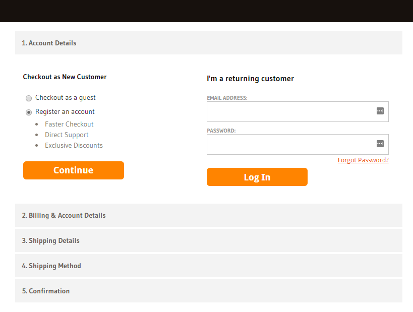
- Highly-Optimized StoreFront for Succesful Promotions
- 33. Do you inform people about an on-going sale through a sticky header/footer on the home page?
- 34. Do you provide a direct link to a particular category during category-wide sales?
- 35. Do you have a dedicated section to list all the items on sale?
- 36. Do you highlight the coupon code on a sticky header/footer so that visitors don’t miss out?
- 37. Do you send out an email to your subscribers to inform them about a time-sensitive promotion?
- 38. Do you display the number of items left in stock or items available at the discounted price during the promotion?
- 39. Do you run single product promotions and send out emails with one conversion goal?
- Building Your Email List
- Abandonment-Proof Checkout Pages
- 42. Do you allow shoppers to either create an account or checkout as a guest?
- 43. Have you displayed security seals on your checkout page?
- 44. Have you divided your entire checkout process into steps?
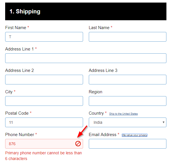
- 45. Do you offer real-time validation to your users while they’re filling out the checkout form?
- 46. Do you link out to your return and shipping policy pages on the footer of your site?
- Optimized Post-Purchase Journey
- 47. Do you display recently viewed items on Thank You pages?
- 48. Do you offer a coupon code to encourage buyers to make their next purchase?
- 49. Do you build a relationship with your buyers through a Thank You video?
- 50. Do you encourage your customers to share about your store on social media?
- 51. Do you inform customers about the promotions in your store on the Thank You page?
- 52. Do you collect feedback on the Thank You pages to understand your buyers better?
- 53. Do you display links to your social pages so that people can stay connected with you?
- 54. Does your order confirmation email tell people about the next steps?
- 55. Do you encourage customers to share product reviews?
- 56. Do you send out promotional emails with the coupon code to encourage next purchase?
- Other Important Stuff You Need To Care About
- 57. Does your 404 page direct people to the other relevant links in your store?
- 58. Is your website optimized for speed?
- 59. Is your website optimized for mobile?
- 60. Do you have an SSL certificate for your site?
- 61. Do you have a Live Chat option to provide help when your customers need it the most?
- 62. Do you fire pixel on your store pages to re-target visitors through Facebook ads?
- That’s A Wrap
- Updates
Homepage Optimization
1. Do You Have a High-resolution Banner Image With Clear Messaging And Call To Action?
Nail your first impression. Make sure all the images and content above the fold can help them form a good first impression of your site.
Notice how Asos’s banner image tells you that it’s a site about clothes. It’s full of personality, and you get a quick sneak peek into the kind of modern western wear they sell in the store.
Avoid distracting carousels, set the tone right:
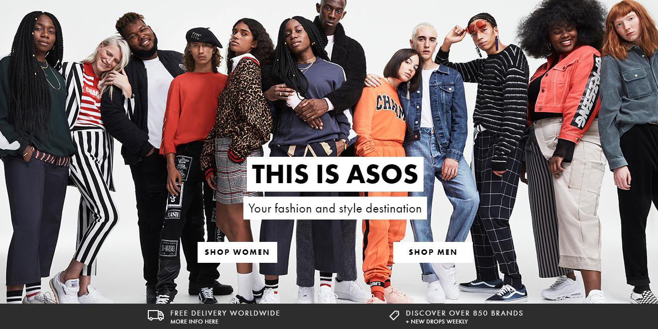
WooCommerce Checklist #1: Banner Image
The messaging is clear and succinct: Your fashion and style destination. It further encourages people to click on one of the two buttons to get started.
The distinct categorization on the home page helps ensure that.
You must provide relevant links in your navigation like ‘best sellers,’ ‘new arrivals,’ on sale items’ etc. It helps people find their way around your site and pacifies anxiety.
Notice how ThinkGeek.com has links to latest arrivals, best sellers, on sale items and more:
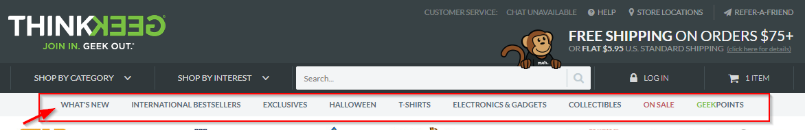
WooCommerce Checklist #2: Navigation Menu
3. Is Your Unique Selling Proposition Well-Articulated And Clear?
The unique value proposition is a positioning statement that explains what you sell.
Here’s an online beauty products seller, Boom by Cindy Joseph’s value proposition:
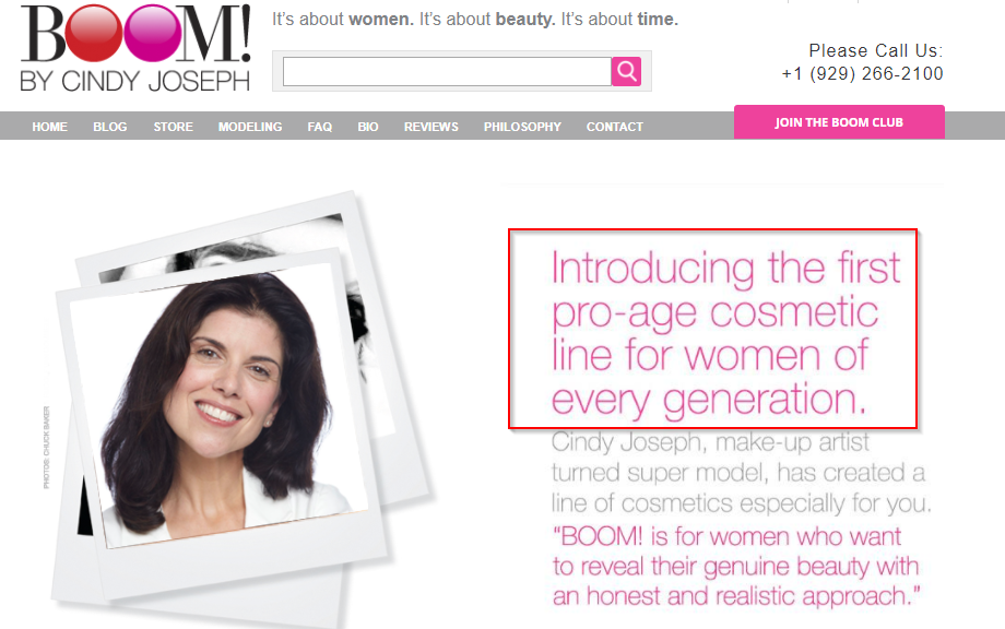
WooCommerce Checklist #3: Value Proposition
‘…The pro-age cosmetic line for women of every generation’ is such a great value proposition. It’s because it tells the visitors whether the products are the right fit for them or not.
It helps start the conversation on the right note and acts as a qualifying statement.
4. Is Your Home Page Keyword Rich With At least 500-700 Words Of Content?
A keyword-rich homepage is great for SEO and can help you rank in Google. And guess what? Your competitors may not be using this trick.
Take a look at Tahoe Mountain Sports site, they show blog post excerpts on the homepage:
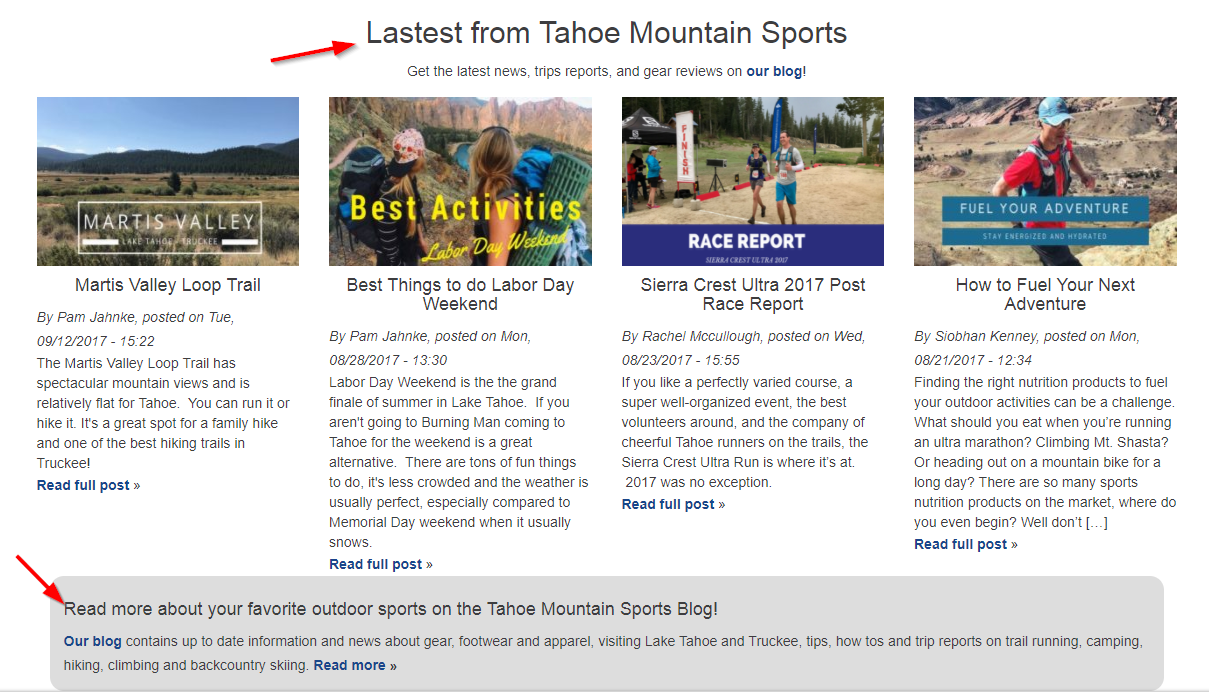
WooCommerce Checklist #4: Homepage SEO
All these excerpts are carefully crafted with relevant keywords.
The other amazing thing about featuring excerpts on the home page is that it increases time on site.
The subtle message this section gives is that they’re not just trying to sell products here but also educating visitors. The sale follows when education is done right.
5. Do You Highlight Social Proof On Your Homepage?
Dedicate a section on the homepage to feature Twitter/Instagram feed from your happy clients. Show them flaunting your products (images with comments).
Notice how ThinkGeek uses a prominent section on the home page for social feed:
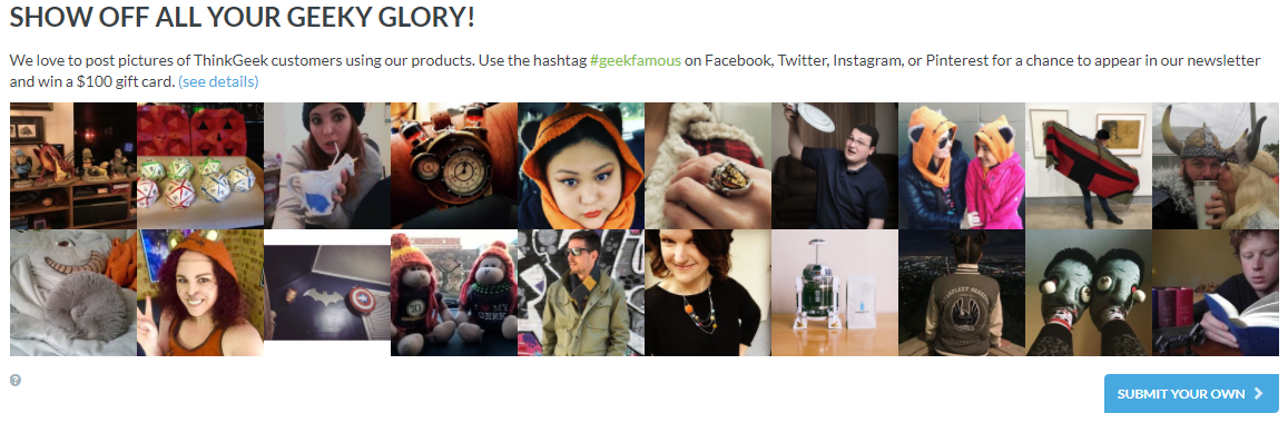 There’s nothing more effective than real people flaunting the company’s products. This section takes care of hidden objections, doubts and irrational fears of potential buyers.
6. Do You Highlight The Free Shipping Threshold On The Sticky Header?
Inform people about an on-going promotion like limited-time free shipping or a sale. You can use a sticky header/footer on the home page to do that.
You can also highlight the free shipping threshold value. Example: Get 100% Free Shipping on all orders over $49.
Take a look at Joss & Main highlight the free shipping minimum order threshold:

WooCommerce Checklist #6: Free Shipping Threshold
Highlighting customer support/helpline number makes people safe about ordering from you.
Online store, Bumblebee linens displays the help number and the availability hours:
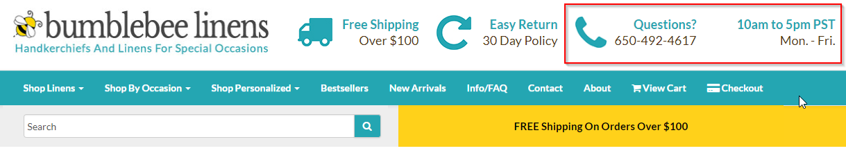
WooCommerce Checklist #7: Helpline Number
Visitors cannot miss out- it’s bright and well highlighted. It’s such a great way to arrest people’s fears and doubts.
8. Do you have credibility boosters such as ‘As seen on,’ ‘Mentioned in’ on your home page?
Got any media mentions or press coverage? The homepage is your place to show off. Tell your visitors that you’re not a store built overnight, but you’ve been working your way up gradually.
And they can trust you with their hard-earned money. Take a look at how Bumblebee Linens features the media mentions on the home page:
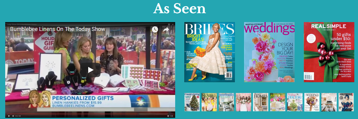
WooCommerce Checklist #8: Mentions & PR
9. Do You Have A Short, Trust-Boosting ‘About’ Section On Your Home Page?
Yes, you should have a separate About Us Page but a quick ‘about us’ section on the home page can have a positive impact on conversions.
It not just gives a boost in SEO but also gives a human feel to the brand. Notice the About Us section on the home page by Tahoe Mountain Sports:
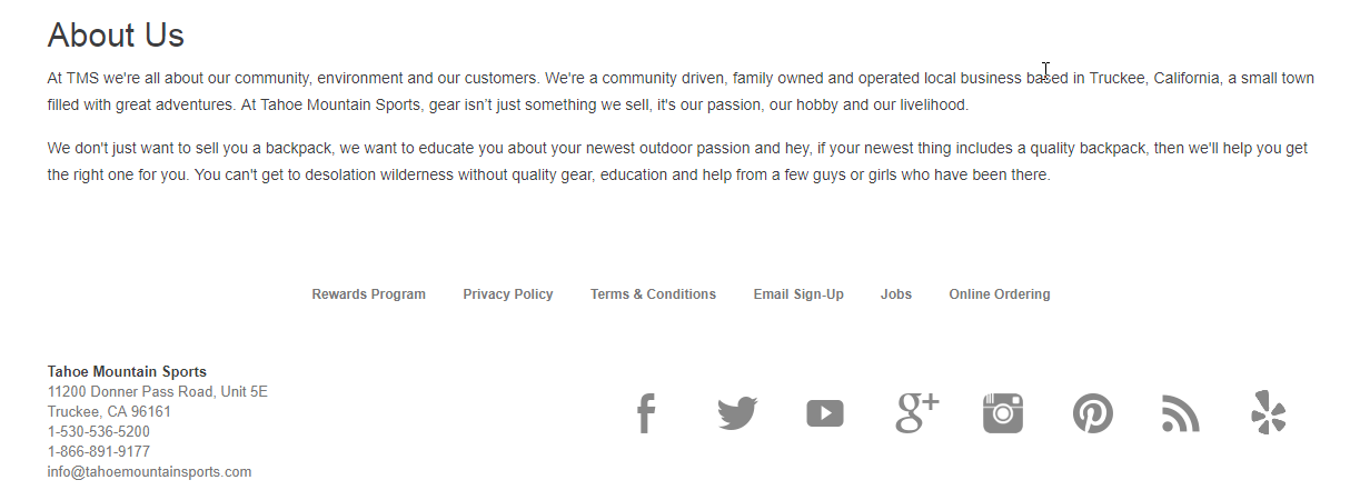
WooCommerce Checklist #9: Short version of About Section on Home Page
The passion for what they do and what they sell shows through this little section which is thoughtfully curated and placed well on the homepage.
Give your shoppers multiple options to choose their payment method.
Here’s another brilliant example from BumblebeeLinens.com:
They’ve displayed the logos of various payment providers and also highlighted satisfaction guarantee:
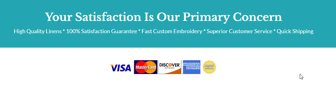
WooCommerce Checklist #10: Payment Gateway Logos in the footer
It is simple, but it helps boost the credibility of the store. It’s little visual cues like these that your customers are looking for to trust your store.
Give your shoppers the option to keep up with your latest updates via email or social channels.
This way you can share with them your latest offers, promotions, new arrivals and more.
Hieutdenim, a UK-based online store uses the footer to highlight all these options:
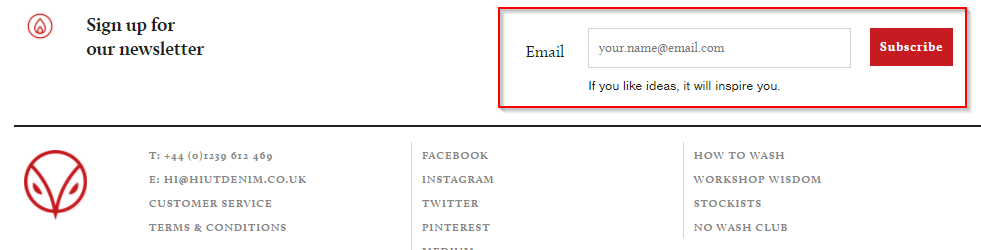
WooCommerce Checklist #11: Newsletter Sign up
12. Have you given links to privacy policy, refund policy, international orders page (if applicable)?
Take a look at this footer with the links to all the relevant pages nicely spelled out:
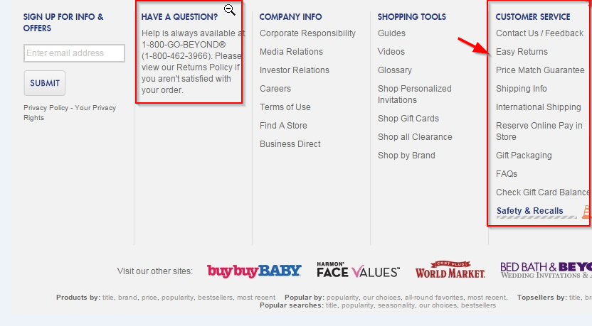
WooCommerce Checklist #12: Useful links in the footer
So that was for your home page, let’s move on to the category page in this WooCommerce checklist.
Category Listing Page
These tags help users find the most relevant products in a quick glance. They also help them, differentiate one product from the other.
You can use tags like ‘best-seller’, ‘just arrived’, ‘on sale’, ‘discounted’, ‘new’ etc.
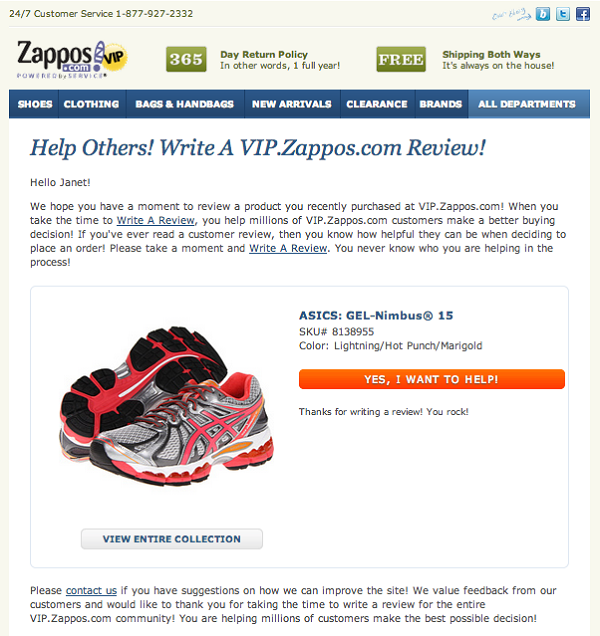
Notice how Zappos displays eye-catching tags on their products.
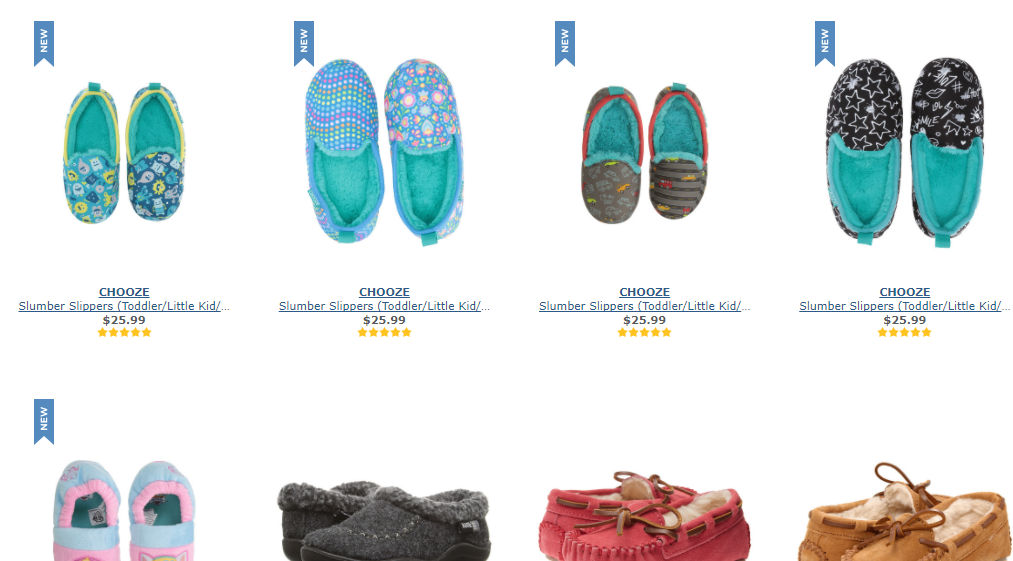
WooCommerce Checklist #13: Category Listing
14. Do you have an option for dynamic filtering on the category page?
Dynamic Filtering allows users to narrow down search results without having to wait for the page to reload.
They can simply tick the options on the menu and the most relevant results will filter out.
It’s so useful and yet many stores do not offer this option. I loved this option on WineLibrary.com.
They allow you to choose the Wine color, price range, size and more from the menu on the left. And the products show up based on what the user selects.
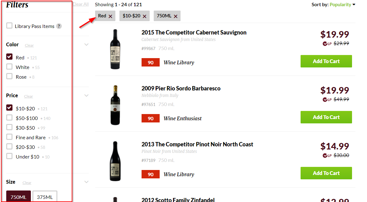
WooCommerce Checklist #14: Dynamic Filtering
15. Do you direct people straight to the product page from category page instead of opening up a pop-up for a quick view?
Quick view pop-ups have become popular among store owners. But don’t fall into this trap. Baymard conducted a research that showed these pop-ups spoil the user experience.
When people click on a product listed on the category page and this pop-up appears, they mistake it for the product detail page. And since the pop-up has incomplete information, it proves to be rather confusing.
The best practice, in this case, would be to lead them straight to the product page.
16. Do you have a description of every category written on the top of its category page?
A few lines of description on the category page is great for SEO. Not just that, it also makes the store easy to navigate and instructional.
Notice how BumblebeeLinens uses the top section to give instructions about customizing hankie and more details about the category.
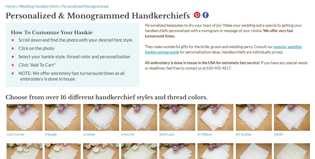
WooCommerce Checklist #16: Category Description (Content-Rich)
They also use it as an opportunity to reinforce their USP i.e. fast turnaround time/help desk availability.
This WooCommerce checklist is incomplete without talking about the product page.
High-Converting Product Page
Watch this video on WooCommerce product page optimization:
17. Is your product page distraction-free?
Zappos.com keeps its product page design minimalistic and clutter-free.
It gives ample space to display a high-resolution image of the shoes. And the column on the right shows price and other product-related details:
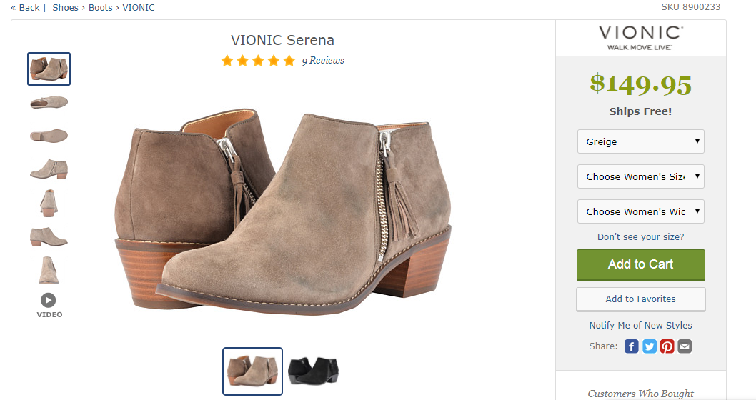
WooCommerce Checklist #17: Distraction-Free Product Page
It doesn’t overwhelm visitors with too much of information.
18. Are your product images high-resolution and shot from different angles?
Your product image is the first thing a visitor will notice on the page. Show close-ups of your products and make sure they are zoomable. Blurry images can be a huge turn-off.
Also, another interesting tactic that you could apply here is to show real people using your product. This tactic helps evoke a desire for the product.
SF Bags has little icons that you can click to view the bag from different angles. They also show the roomy interiors of the bag:
WooCommerce Checklist #18: High-resolution product images
19. Are your product descriptions well-formatted and easy to read?
Avoid using blocks of text – people are too lazy to read them. Also stay away from flowery language.
Write the benefits in proper bullet points and short sentences.
Notice how Zappos features well-formatted product description. It uses sensory words to describe the dress and shows a real person wearing it:
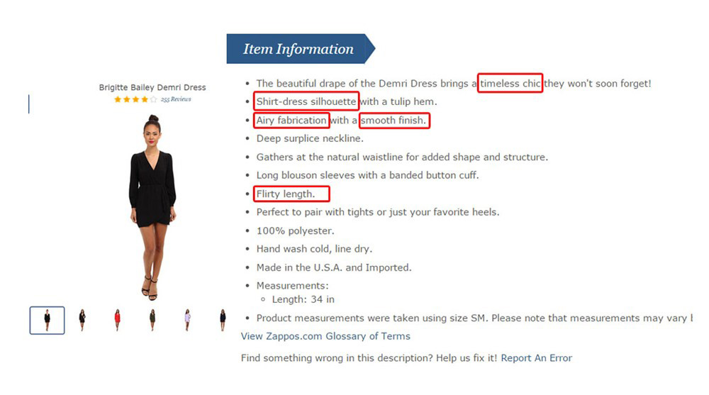
WooCommerce Checklist #19: Well-formatted product description
Each bullet point is short, crisp and to the point. There’s no beating around the bush, repetition or redundancy. It’s all scannable, and there’s no use of jargon or complicated language.
Facts like 100% polyester or made in the USA are all listed in the bullet points. That’s the kind of product description you should aim for.
20. Do you tell your shoppers how best they can use your products?
Make sure you communicate how best your buyers can use your product. Give them a compelling reason to shell out the money for it.
Example: “Perfect to pair with tights or just your favorite heels.”
21. Got a time-sensitive deal on your product? Do you show a countdown timer to communicate the deadline?
Urgency kills procrastination and increases sales.
Take a look at how Amazon.com shows a prominent countdown timer on the product page to induce urgency: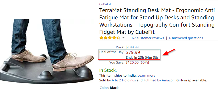
22. Is your product available in a limited quantity? Do you highlight the number of items left in stock to create a sense of scarcity?
Take a look at how Boticca.com uses scarcity and urgency to nudge visitors to the finish line:
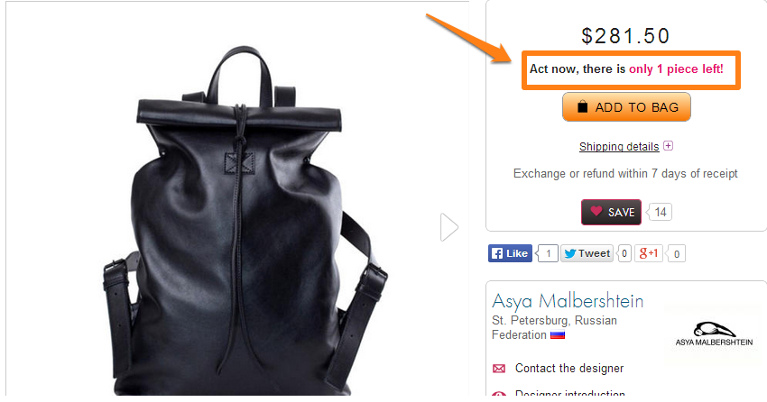
The language is persuasive- it gives window shoppers a likely reason to grab their wallets without delays.
But make sure you’re creating authentic scarcity, do not manufacture it. Use it wisely but do use it.
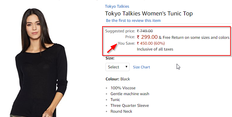
23. Do you display the exact savings (in percentage & dollars) on the discounted items?
Savings replace the pain of parting with money with the joy of finding a good deal! Let your shoppers know the exact savings they will make by buying the item.
This helps them justify their purchase decision to their rational mind. See how Amazon.com highlights the savings appropriately:
24. Have you highlighted guarantees to uproot all last-minute, sales-blocking objections of your visitors?
The absence of strong, credibility-boosting guarantees can break the deal.
You don’t want to give this a miss!
Bumblebeelinens.com has an impressive way of highlighting the guarantees. The box catches shopper’s attention.
It also makes their product page look way more credible than any of their competitors:
25. Do you highlight your best-selling products with an eye-catching ‘best-seller’ badge?
Best Seller badge acts as a great social proof and helps people make the buying decision. It’s the reason why you choose the crowded restaurant over an empty one. In science, this is called the Halo effect.
Take a look at how Amazon displays its best-seller badge:
![]()
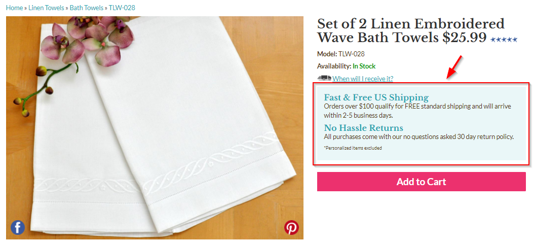
26. Do you display the estimated delivery details on the product page?
As per a study published on Behave.org, a Netherlands based store increased their eCommerce store conversion by an impressive 8.6%. It was by featuring important details about product delivery on the product page.
They created a sense of urgency by encouraging people to place the order before the counter struck zero for faster delivery.
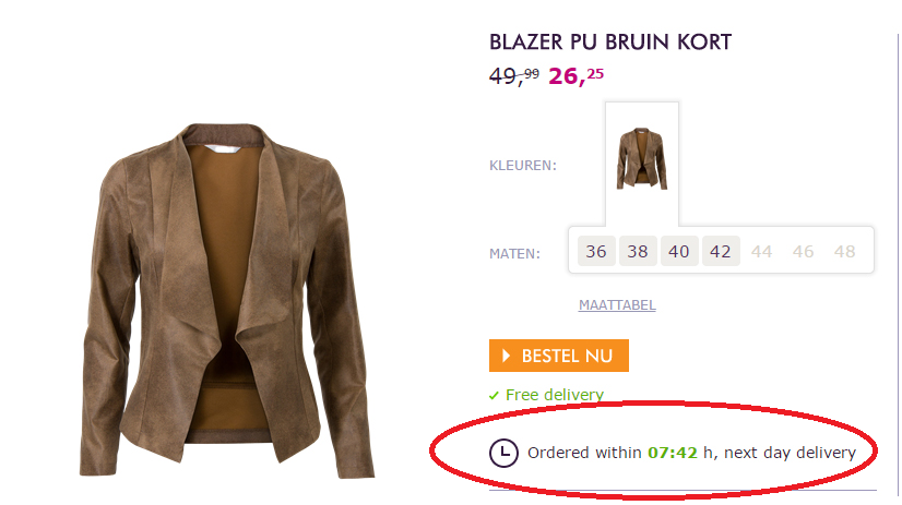
You too can create a sense of urgency and encourage people to place their order before the counter hits zero.
27. Do you have an FAQ section to address all their last-minute & sales-blocking objections?
Roller Skate Nation, an online store reported a 69% lift in conversions with the FAQ section. They placed it below the product description on all the product pages.
Here’s how the store now answers common questions related to shipping & returns in a separate tab:
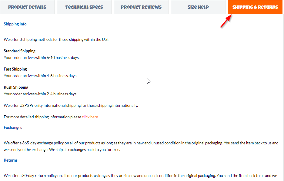
This technique alone will have an incredibly positive impact on your WooCommerce conversions. Try it out.
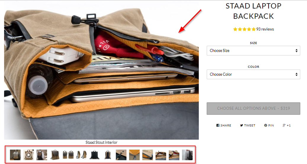
28. Do you feature high-quality videos on your product page that show your product from different angles?
Product videos increase retention and the desirability to own the product.
SFBags features an excellent 2-minute video on the Staad Laptop Backpack.:
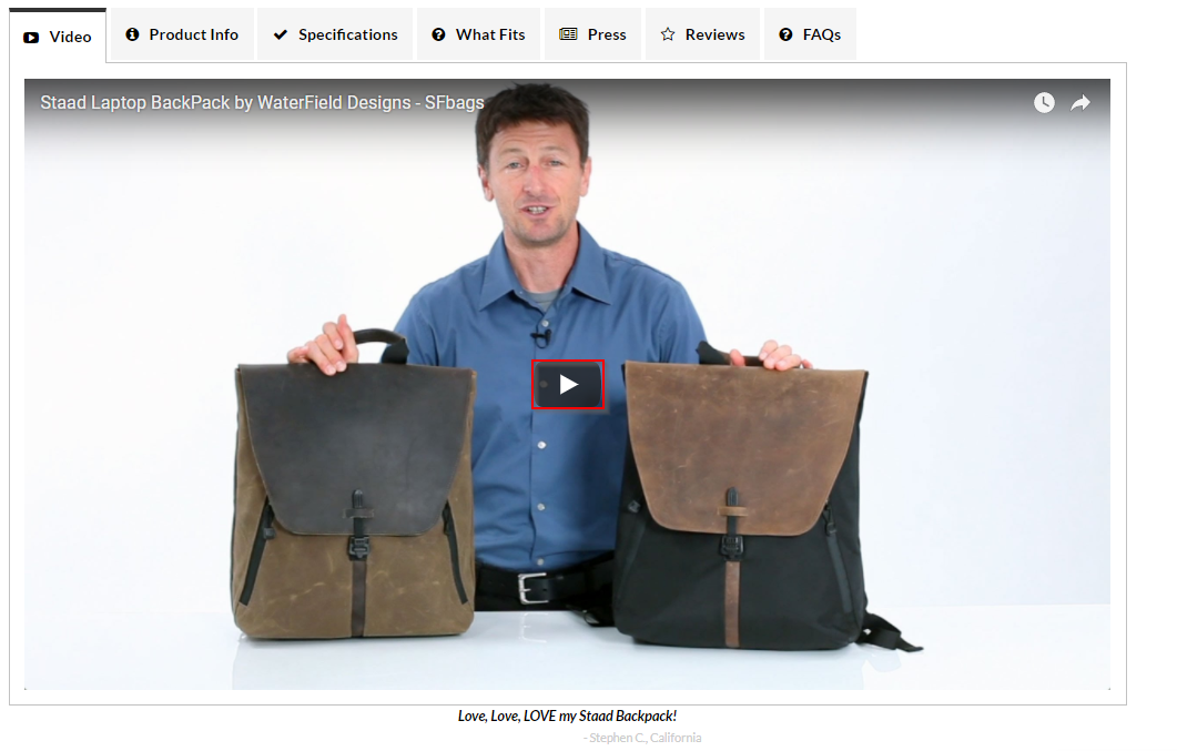
The host introduces the product, establishes the need and walks through its features.
He further dives deeper into the variants and the different colors of the bags. He accentuates on the product design and attention to detail. Overall the video quash all last-minute objections and make the product feel desirable.
Take a few minutes to watch this video:
You know your products best so why not get talking!
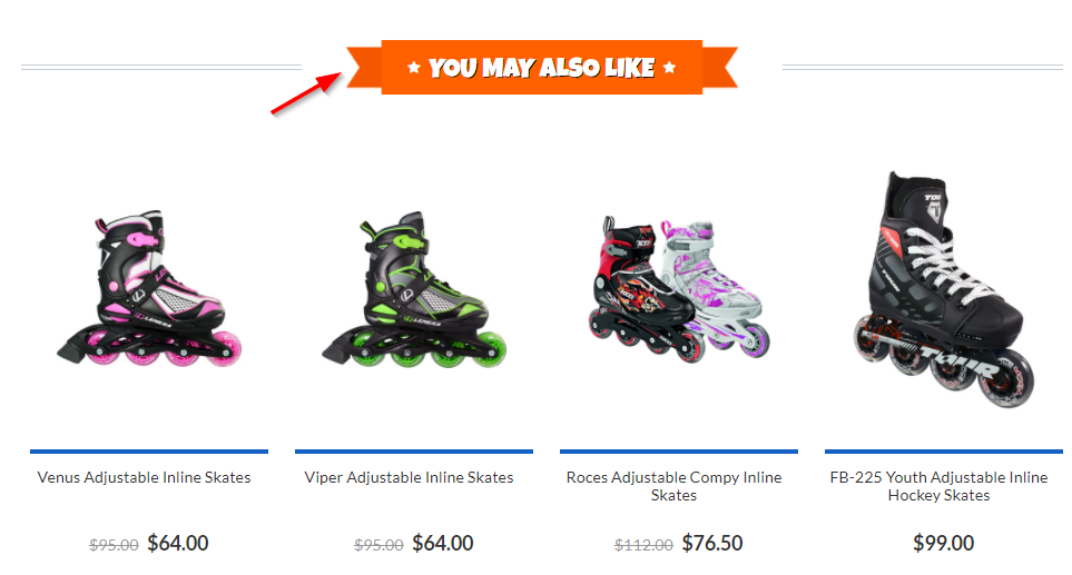
29. Do you feature a product recommendation section towards the bottom of your product pages?
As per Sucharita Malpuru, Amazon’s sales from the on-site recommendation is 60%. WooCommerce allows you to add linked products to every product.
You can add cross-sell and upsell items. Also, WooCommerce pulls out related products. These products share common tags or belong to similar categories.
Here’s how RollerSkatesNation.com displays recommended items on the product page:
30. Do you show customer reviews along with the date of publishing?
Take a look at how popular site, Mancrates.com features the review section:
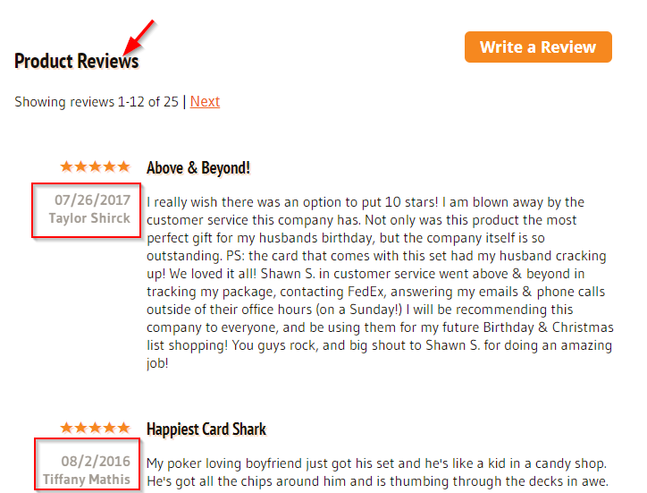
It highlights the publishing date and the name of the buyer. It makes the review section credible and more accurate.
31. Do you show ‘get notified’ option on out of stock products?
Allow people to leave their email id so that you can email them when the item is back in stock. This will not only help you build an email list but also you can contact them when your product is back in stock.
Take a look at how Nykaa.com shows a form on the product page encouraging them to leave their email:
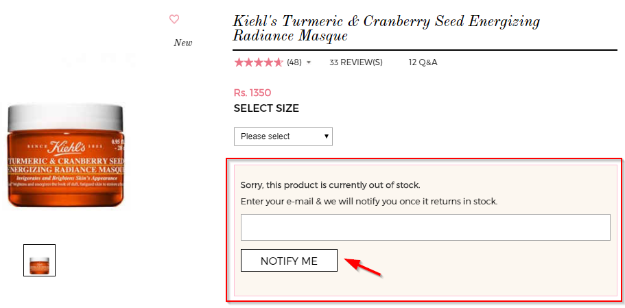
It is so much better than putting up a cold message, ‘This item is out of stock’ and leaving the shoppers on a dead end.
Watch a video here to learn more about WooCommerce product page optimization
Let’s now explore how to improve the credibility of your WooCommerce store. That’s the next segment in this WooCommerce checklist.
Credibility-Boosting About Page
32. Do you form a connection with a compelling story on the About Page?
About page is your page to flaunt a bit of personality. And it’s also the page that differentiates you from any of your competitors. So go ahead express yourself – tell your store, engage your visitors and give them a reason to buy from you.
Here’s the about page of Natural Force, an online store that sells natural supplements. Started by two friends, they tell a captivating story on their about page:
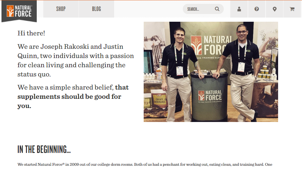
It shows that it’s not just a store that sells random stuff but one that has real humans powering it and a mission that leads it.
Some strong credibility cues there.
Highly-Optimized StoreFront for Succesful Promotions
Give people the most relevant information first. Let them know about the ongoing promotion in your store as soon as they land on it.
It will help you start the conversation on the right note. You can use a sticky header or footer to inform about the promotion details. It will help them make a purchase decision faster than they otherwise would.
Take a look at how ProFlowers highlights the time-limited 15% discount offer:
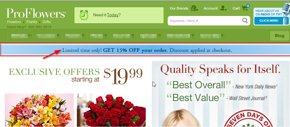
This alone has the power to lift WooCommerce conversions during promotions.
34. Do you provide a direct link to a particular category during category-wide sales?
Help people get to the relevant pages in 3 quick clicks.
One of the ways to do that is to inform them about the ongoing category-wide sale. And place a CTA button on the sticky header that directs them straight away to that category.
Notice how Asos.com has a sticky header on the home page that informs people about the ongoing autumn sale. It offers them two CTA buttons to get to the relevant pages right off the bat:
![]()
35. Do you have a dedicated section to list all the items on sale?
List all the items on sale on a separate page and offer a link to that page from the home page. It will help people find the right deals for them.
The term ‘deal of the day’ is searched 74000 times every month. IT means people look for daily deals and lucrative offers every day.
Give them an option to explore all the items on sale on a single page. Notice how Think Geek lists the items on sale on a single page:
You will find a significant chunk of your visitors clicking on the ‘deals & discounts’ or ‘on sale’ section from the home page.
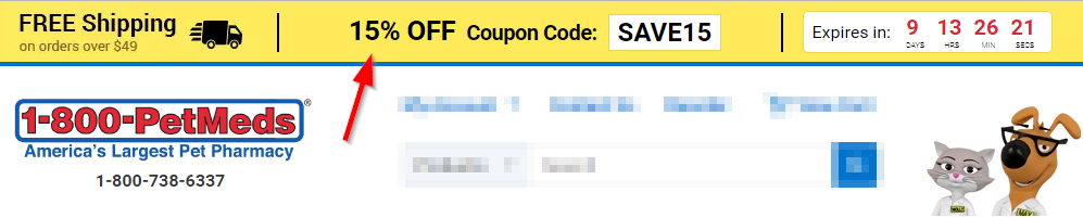
Using coupon code makes shoppers feel special, but if they can’t find the code, it’s a big turn off!
Take a look at how PetMeds.com makes sure that their visitors would not miss the coupon code and the ongoing offer:
37. Do you send out an email to your subscribers to inform them about a time-sensitive promotion?
You can embed a countdown timer in your emails to prevent inaction on your emails.
Take a look at this email from eCommerce store, Barnes & Noble:
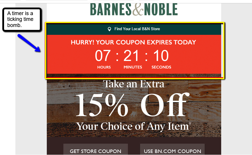
It has a countdown timer right at the top that lets subscribers know that it’s a deadline-bound sale.
38. Do you display the number of items left in stock or items available at the discounted price during the promotion?
Creating an authentic scarcity can increase people’s desire to own a product.
An interesting case study: As per Monetate.com, an online retailer conducted an A/B test. Version A was without the scarcity bar and the time limit, the Version B was with them:
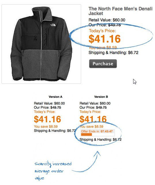
Version B increased average order value by 0.07% and this translated into a million-dollar + increase in the company’s revenue.
39. Do you run single product promotions and send out emails with one conversion goal?
Most eCommerce stores send out emails featuring multiple products. There multiple calls to action competing with each other.
Because of which their emails start looking cluttered with choice overload.
You can run single product promotions and focus one email on just one product. Tell your subscribers the benefits of that product and give them a coupon code to buy that item.
Take a look at this single product promotion email sent out by Nykaa.com with the coupon code:
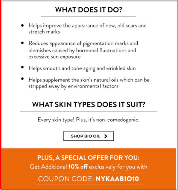
This email has only one focus which is to sell the Bio-oil. It’s laden with the product benefits and leads people to a single page. The coupon code has been customized for the promotion.
‘Focus’ a smart strategy in the world of distractions.
Read more about promotions: 9 untapped WooCommerce discounts and deals strategies for your store.
Building Your Email List
40. Do you use discount-offering pop-ups to capture emails of your visitors?
Don’t let your visitors leave without giving you their emails. Put a system in place to capture their emails so that you can get back to them after they exit the store.
Take a look at how Kate Spade offers a 15% off plus free shipping in exchange for joining the email list:
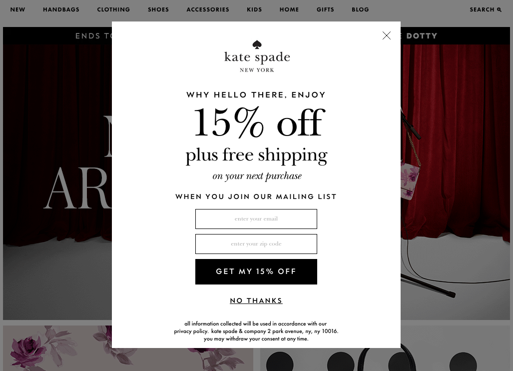
It’s a great way to push people off the fence and give them a compelling reason to convert into subscribers and then into buyers.
41. Do you have a system in place to send out on-brand welcome emails?
Focus on your welcome emails. They will help you start the conversation with your subscribers on the right note.
Welcome them to your tribe so that when you send them emails about promotions, they read it and take action.
Take a look at Roller Skate Nation’s welcome email, it’s on brand and well written:
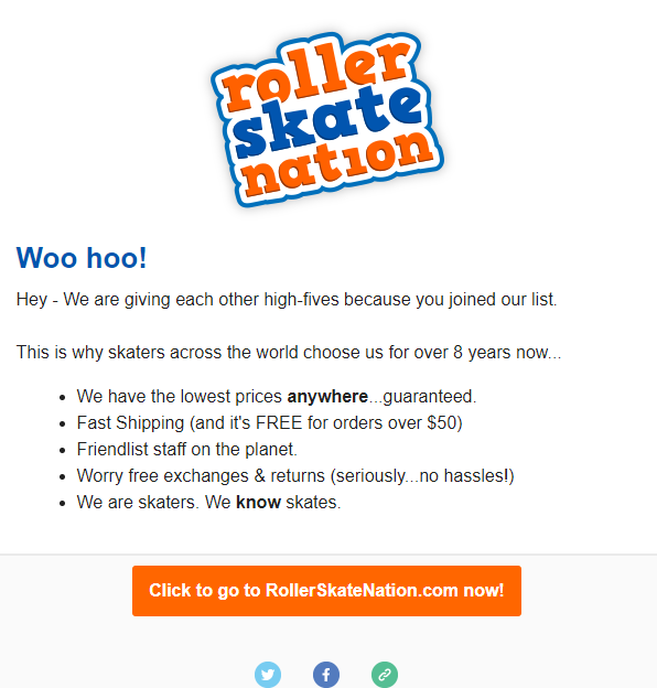
Notice the use of language: ‘woo hoo!’, ‘hi-fives,’ ‘we’re skaters’ – that’s what their brand stands for! The brand is about fun and skating. It’s a personality infused email.
Keep moving forward, checkout pages is next in the WooCommerce checklist.
Abandonment-Proof Checkout Pages
42. Do you allow shoppers to either create an account or checkout as a guest?
Here’s how ThinkGeek.com offers both the options to the users, i.e., to create an account or checkout as a guest: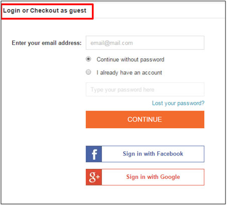
It’s a clean and clutter-free interface. Also, you must notice that they capture the email first before everything else. This technique helps them reach out to shoppers if they abandon the cart.
We’ve created an insightful post on how to recover more abandoned carts using a smart revenue recovery system. You’ll also learn how to set up automations to reach your abandoners on autopilot. Do not forget to check it out.
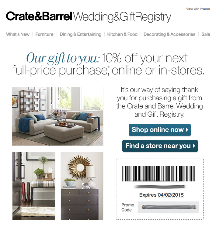
43. Have you displayed security seals on your checkout page?
Lack of trust seals is the #1 conversion killer. You don’t want to be in that grey area. Take a look at how Crate & Barrel displays the security seals on the checkout page:
![]()
Check out Google Customer Reviews to feature customer reviews and increase the credibility of your site.
44. Have you divided your entire checkout process into steps?
Divide your checkout process into proper steps.
One website saw a jump of 300% in their conversions when they swapped a one-page checkout with a multi-step checkout form.
Here’s an insightful post on 21 optimization hacks that you can implement on your WooCommerce store to completely optimize your checkout pages.
Take a look at how ManCrates split the checkout options into five main stages:
Its instructional user interface moves people one step to the next smoothly.
45. Do you offer real-time validation to your users while they’re filling out the checkout form?
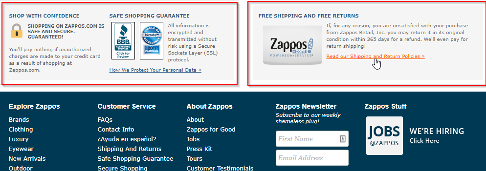
Take a look at how Zappos.com gives links to its data protection, shipping, and return policy:
This WooCommerce checklist is incomplete without a detailed guide on the post-purchase user journey.
Optimized Post-Purchase Journey
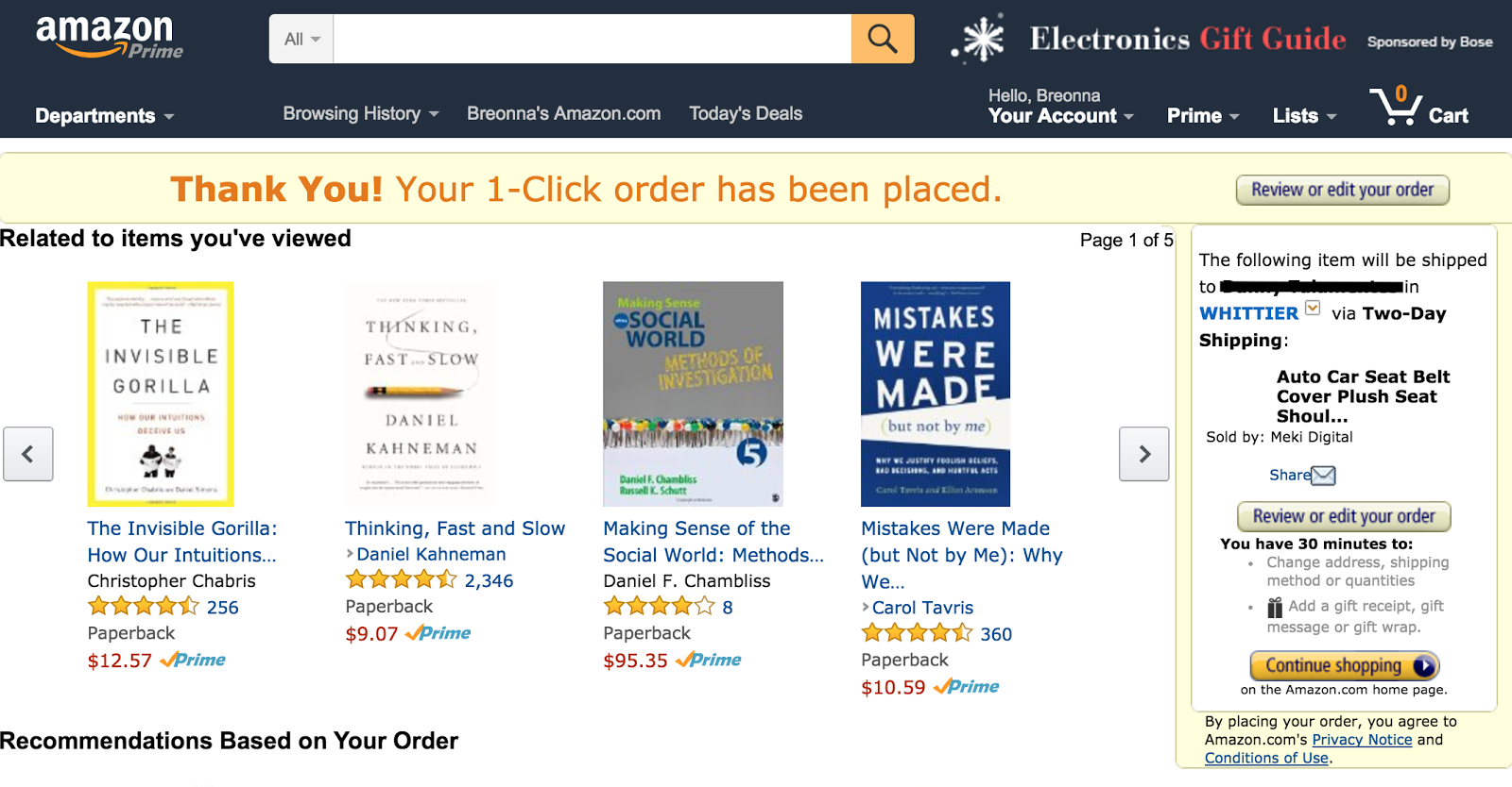
47. Do you display recently viewed items on Thank You pages?
Thank you page is a great page to remind your customers what they’re leaving behind. Now that they trust your store, they may get pulled back into the funnel.
Take a look at Amazon.com’s recommendation on the order confirmation page:
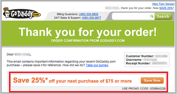
48. Do you offer a coupon code to encourage buyers to make their next purchase?
A coupon code triggers an urge to buy again.
Give your buyers a deadline-bound coupon code. You may even go a step further and personalize this code. See Godaddy’s thank you page with the coupon code:
49. Do you build a relationship with your buyers through a Thank You video?
A well-shot Thank You video goes a long way in taking the relationship forward. Don’t forget their attention is at its peak on that page.
See how Hello Matcha shows a nice, helpful video tip on the order confirmation page related to the order: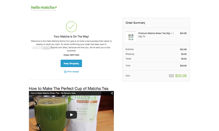
Warby Parker has an awesome way of helping buyers to spread the word about the store:
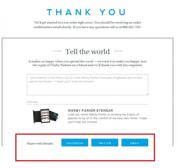
Warby Parker offers a pre-written message to share it with friends. All that buyers have to do is click a few buttons, and you’re on a roll!
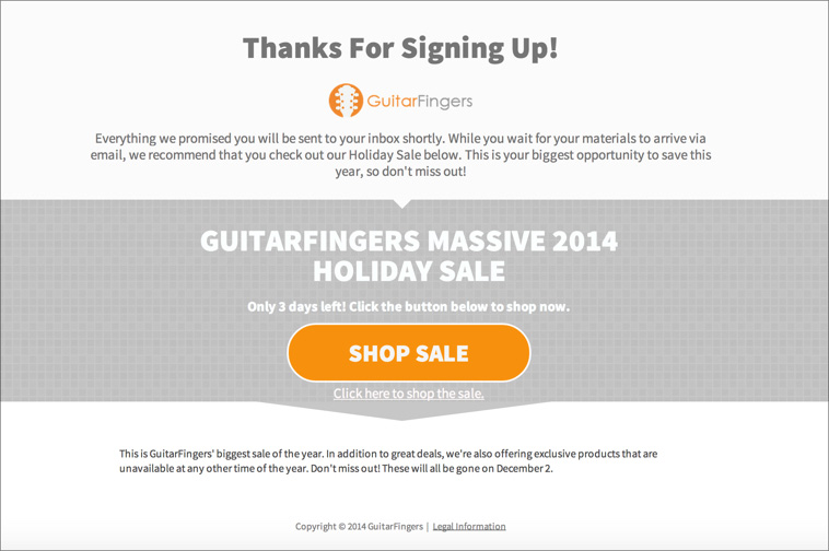
51. Do you inform customers about the promotions in your store on the Thank You page?
Take a look at how GuitarFingers directs people to participate in the sale:
52. Do you collect feedback on the Thank You pages to understand your buyers better?
Your shoppers are most attentive on the Thank You page. It is a great place to ask them important, interesting questions and get great insights.
So put together a quick survey form that helps you get a sneak peek into their needs, usage, and behavior.
Take a look at how Harry’s features a quick survey form on the thank you page:
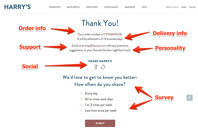 It is such a genius strategy, try it!
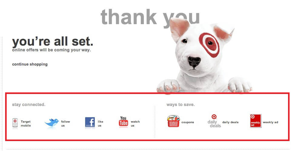
Take a look at how Target offers links to its social pages on the Thank you page. And features an encouraging message to invite people to join:
Read more about Thank You pages:7 overlooked WooCommerce Thank You pages hacks here.
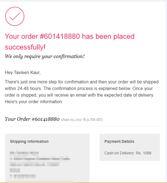
54. Does your order confirmation email tell people about the next steps?
Your customer has placed their order, now it’s the time to live up to their expectations.
Make them feel safe post-purchase. Take a look at how this store sends on-brand confirmation emails:
Here’s the next email they send to inform about the creating shipment:
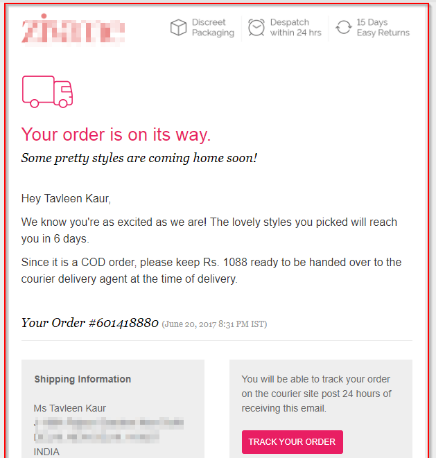
What I really like about this email is the way they link a review to helping out another prospect. The email is written in a conversational tone and it sets the right context.
The email first highlights the importance of reviews and then goes on to ask for one. Incredibly effective!
If you’re also drafting your review emails, focus on conversing with your customers.
56. Do you send out promotional emails with the coupon code to encourage next purchase?
It’s a very effective strategy. Your customer has read your transaction emails, they’re now more likely to open what you send.
Take a look at Crate & Barrel’s email with the promo coupon:
Other Important Stuff You Need To Care About
57. Does your 404 page direct people to the other relevant links in your store?
Take a look at this super compelling page by Bed Bath & Beyond. It’s clutter-breaking and uses humor to engage visitors.
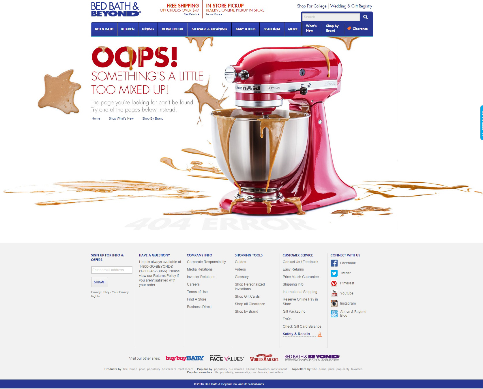
Also, you must notice, it gives instructions to the guests about what to do after they land on this page.
58. Is your website optimized for speed?
Take a look at these stats:
51% of shoppers say they will leave the site if it takes too long to load
18% of shoppers will abandon carts if the checkout pages are slow.
For every 1 second delay in store-page loading, there are 7% lesser chances of converting.
Make sure that despite the size of your site, the speed is not being compromised.
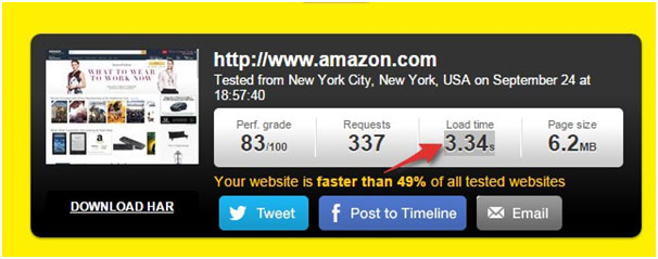
To test your website on speed parameters, hit the URL below:
http://tools.pingdom.com/
If your store is not loading in under 4 seconds, it is time to raise red flags.
Amazon.com despite 6.2 MB page size has a load time of 3.34 seconds, which is really good:
59. Is your website optimized for mobile?
Not sure if you should spend all the effort on optimizing your site for mobile? Think again. Now take a look at these stats:
- 70% of searches on a smartphone lead to an action on the website within an hour
- 40% of mobile visitors abandon websites that are not optimized for mobile
eCommerce websites not optimized for mobile require visitors to zoom in/out, swipe pages and deal with extra large images. All of this leads to a poor shopping experience.
Check if your site looks like this when you reduce the window to the screen size of a mobile:
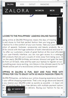
Notice it requires one to swipe left and right to read the sentences.
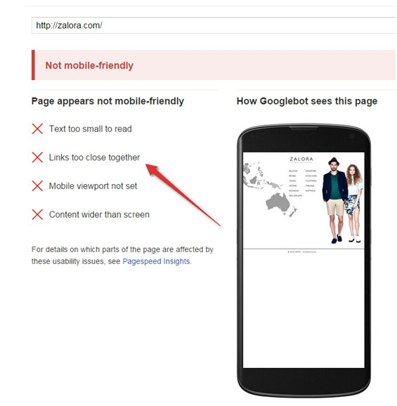
Check your store’s mobile-friendliness here>>
The results will give you a great deal of insight into the major errors on your site when it’s viewed on mobile. I checked for Zalora.com and the results weren’t impressive at all. Take a look:
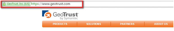
60. Do you have an SSL certificate for your site?
SSL (Secure Sockets Layer) is the standard security technology for establishing an encrypted link between a web server and a browser.
SSL protects your sensitive information and data as it passes between web servers and browser.
The website with SSL has a lock icon or a green bar the top:
Head out to this comprehensive guide and learn everything about migrating your site from HTTP to HTTPS.
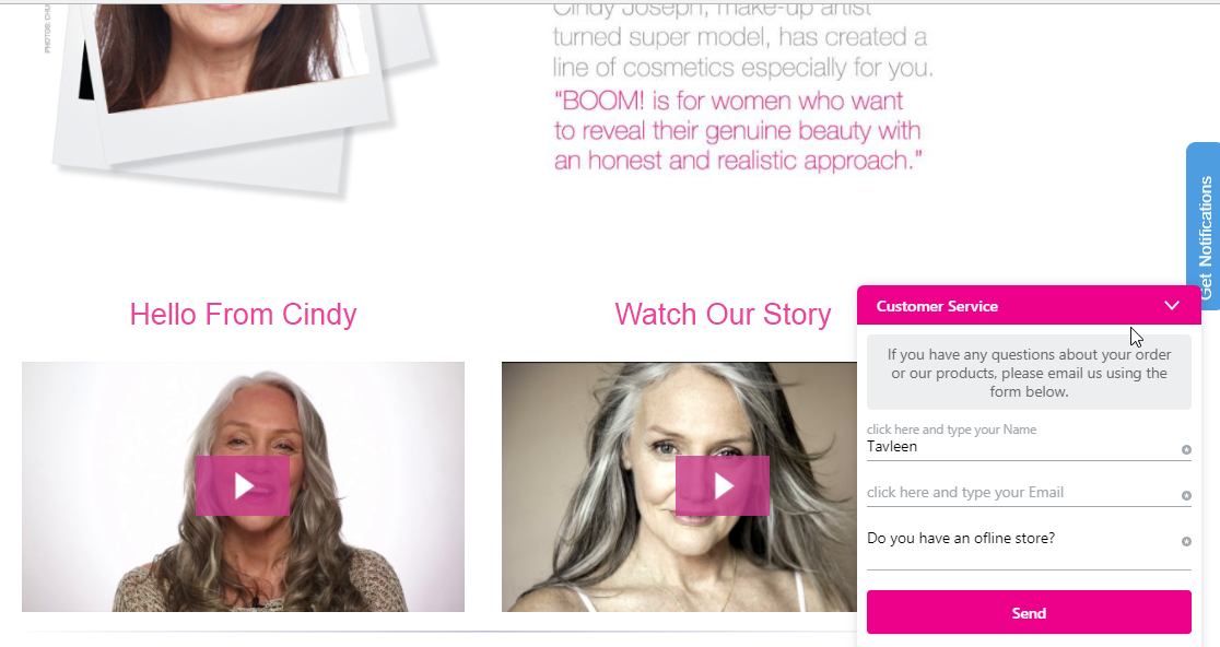
61. Do you have a Live Chat option to provide help when your customers need it the most?
As per eConsultancy.com, live chat has the highest customer satisfaction rate. It’s as high as 70%. Just to put things in perspective, the satisfaction rate of emails is 61% and that of the phone is 40%.
Live chat bridges the gap between the online and offline world. It can convert a confused or anxious prospect into a confident buyer. So why give this a miss?
Take a look at the Live Chat option on BoomByCindyJossph.com:
62. Do you fire pixel on your store pages to re-target visitors through Facebook ads?
Add Facebook pixel code to your website to track Facebook users who visit your site. You can add ‘Facebook Pixel Helper’ chrome extension. It’s a very handy tool and gives you real-time feedback on the implementation:
![]()
That’s A Wrap
That was indeed a long WooCommerce go-live checklist! But I am so glad you made it all the way to the end! I’d love to know which point was your favorite.
Was there something that I missed or glazed over? Let’s talk in the comments.
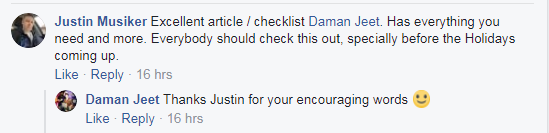
Updates
After writing this post we have got lots of positive feedback. I will continue to update this post with more golden nuggets.