eCommerce Conversion Killers: Meet Top 8 Sneaky Killers & Fix Them Fast
Want to identify the top eCommerce conversion killers in your biz? Good move! Read on…
Your prospect, Laura comes to your store. Your products and the prices are great.
But she doesn’t believe in your store’s credibility. She hasn’t ever bought from you. There’s something that just doesn’t convince her.
And the next thing you know…she’s lost in the ether, leaving no traces behind.
Well…don’t you worry! In this short read, I am going to take you through 6 + 2 (bonus) sneaky conversion killers that are putting shoppers off.
We’ll also discuss how to fix them so that you’re not left wondering why your store sales are slow.
Contents
- #1: Lack of a Clear Value Proposition
- #2: Featuring Flowery Product Descriptions
- #3: Not Spotlighting Good Deals or Enticing Bundles
- #4: Not Giving Shoppers a Reason to Act Fast
- #5: Absence of Live Chat or Helpline Number
- #6: Skipping Credible Guarantees
- Bonus Killer #1: Asking for Coupon Code on the Checkout Page
- Bonus Killer #2: Lack of Credible Reviews
- The Truth About eCommerce Conversion Killers
#1: Lack of a Clear Value Proposition
Selling dog leashes? Or pet food? Or coffee mugs? Maybe T-shirts?
No matter what you’re selling, chances are it’s not so unique that nobody else is selling them. Your prospect has a hundred options to choose from.
What sets you apart is exactly what will draw people towards your products.
Here’s a simple way to find out what your value proposition is. Answer this question for your business:
“Why should people choose you over your competition?”
Here are some cues to formulate your value proposition:
- How is your product made?
- What is the product made of? And how do you procure those materials?
- What’s your personal story and how does it connect with what you sell?
- What are the unique benefits of your product?
Here’s an example from Huite Denim. The value proposition is clear, succinct and credible:
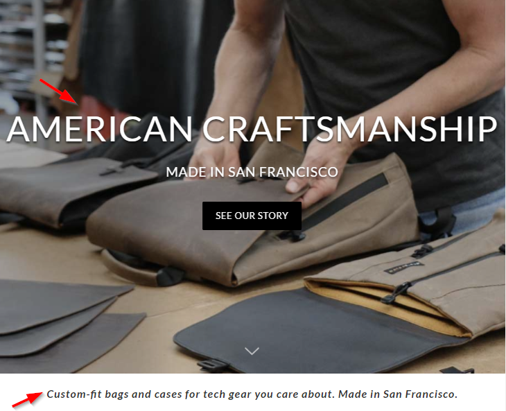
Notice the one-line at the bottom. These are custom-fit bags made in San Francisco. Sold!
#2: Featuring Flowery Product Descriptions
Flowery product descriptions are pretty common in the eCommerce world.
Several stores describe products using the choicest of words. Words like stunning, fashionable, amazing.
These words really don’t mean anything. In fact, they make your product lose its credibility.
The key here is to be specific; highlight the details, focus on the facts and talk about the use cases.
Here are some pointers to write killer product descriptions:
1.Highlight what makes your product a must-have item
But what if you’re selling simple T-shirts?
What on earth makes a T-shirt a must-have? Great question! How about saying:
“The 100% cotton tee is non-sticky and keeps you cool. It’s an essential addition to your summer wardrobe!”
Or:
‘This little black dress is your answer to ‘What should I wear tonight?’ problems. A must-have for your wardrobe, no matter the occasion!
- List the benefits in short bullets to make them scanner-friendly
Take a look at this example from a cosmetic store, it lists the benefits in clear and succinct bullet points:
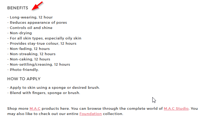
One can read it in one go. There are no walls of text here.
- Map features with benefits
People are lazy. Listing your product features alone will not do justice to your product.
For every feature – ask yourself ‘so what?’- The answer to this question will help you drive the benefit of the feature.
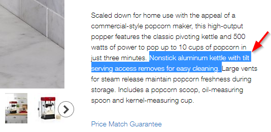
Here’s a brilliant example of a popcorn maker:

#3: Not Spotlighting Good Deals or Enticing Bundles
The absence of good deals or enticing bundles can be a big roadblock in sales. At times people get pulled in and make a purchase only because there is a good deal going on.
So feature a deals section or enticing bundles listed on your site to pull people in.
Take a look at this example from Crate and Barrel:
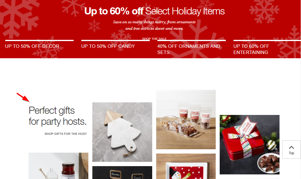
The offer is clearly stated at the top. Shoppers can browse for gifts at a discount right off the bat. They don’t have to hunt for deals.
Here’s another interesting example from Brooklinen- they’ve highlighted the bundle on the homepage:
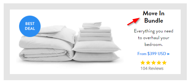
The idea is to handhold confused shoppers to the buy button.
It’s to help people make a faster decision without having to explore several other options. Also, notice they’ve used the ‘best deal’ badge to make the deal sound exclusive.
#4: Not Giving Shoppers a Reason to Act Fast
Creating urgency around your offer is the key to closing the sale. Can you imagine a salesperson saying – ‘You’ve got plenty of time, make the decision when you want. There’s no hurry!’
He’ll never close the deal!
That’s because our internal defense mechanisms to losing money are pretty strong. We’re wired to respond well to urgency.
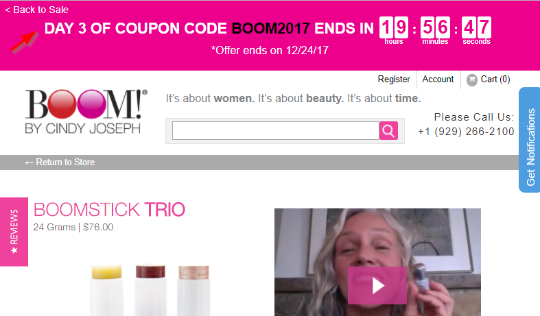
Here’s a brilliant example of creating urgency around the offer. There’s a definitive deadline and the coupon code is highlighted well right at the top:
#5: Absence of Live Chat or Helpline Number
Think about this: Your prospect wants your product. She’ll be happy to buy at the set price but she’s got a last-minute pressing concern.
One little last-minute concern can come in way of sale. So why shouldn’t you do everything in your control to eliminate that concern?
Here’s an example from BoomByCindiJoseph again with the Live Chat: 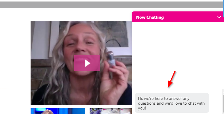
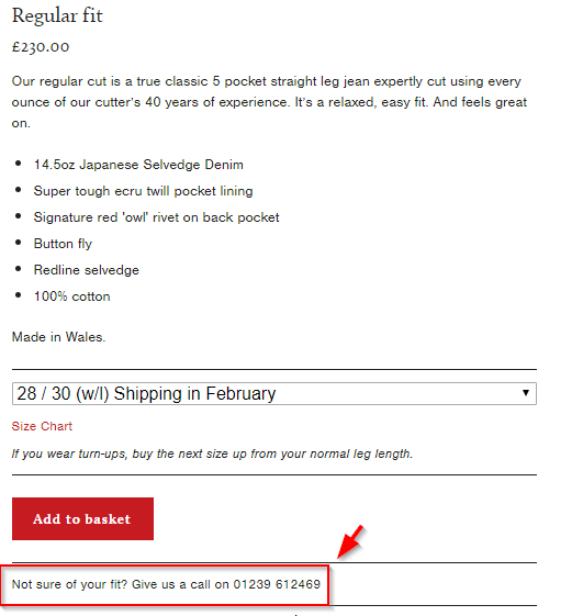
If not live chat, you can offer your helpline number and arrest their unspoken fears. Here’s an example from Hiut Denim:
#6: Skipping Credible Guarantees
There are two most important factors that shoppers are most concerned about. One is shipping and the other is returns.
Make sure you mention the details about both in your guarantee box.
Notice this guarantee box on BumblebeeLinen’s product pages –
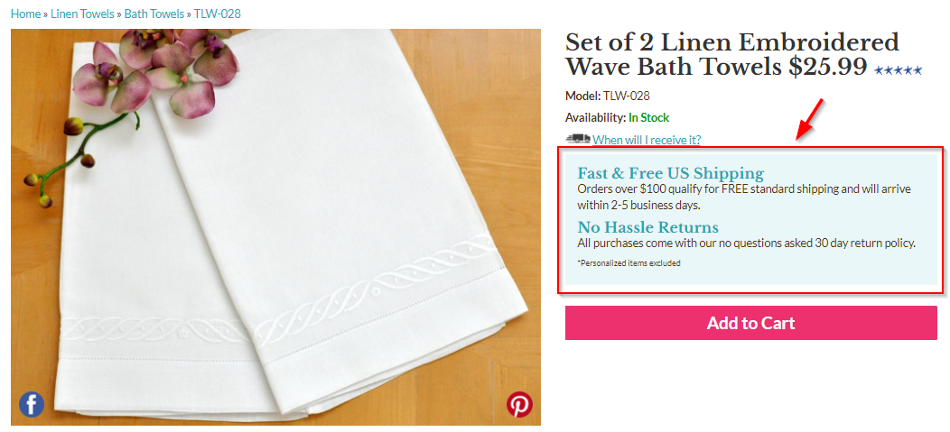
They’ve highlighted the information about the minimum order threshold for free shipping, the number of days it’ll take to ship and the return policy.
Set up a guarantee box to address your prospects’ hidden doubts.
Bonus Killer #1: Asking for Coupon Code on the Checkout Page
I don’t know about you, but whenever I see an empty coupon field while shopping online, I always search for a coupon code.
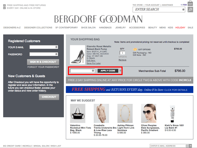
I see it as an opportunity to pocket some last-minute savings and obviously rush to search for codes. But the worst part is that the search leads me to spammy links with random, mostly expired coupon codes.
This whole experience is so irritating and wastes too much time.
It diverts a serious shopper and takes them down a dead-end alley. She would only make a comeback if she’s really committed to buying that item. In most cases, she’ll find the slip route to the big exit.
The coupon code input field on your checkout pages may be putting off your shoppers too.
A bit of research led me to the Disney Store and I saw an interesting way of handling this:
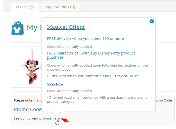
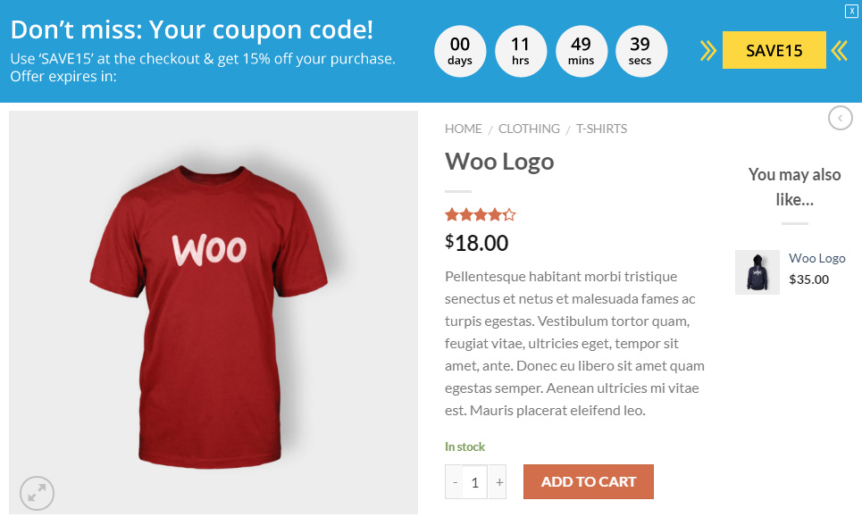
Another brilliant way to handle this is to highlight the coupon code front and center. Put it up in the sticky header so that shoppers just cannot miss out:
Bonus Killer #2: Lack of Credible Reviews
Your customers are your best salespeople. Their reviews definitely add more credibility to your product pages. People feel comfortable about buying a product that other shoppers recommend.
Also, it makes your shop feel more trustworthy. Take a look at this review section in SFBags.com:
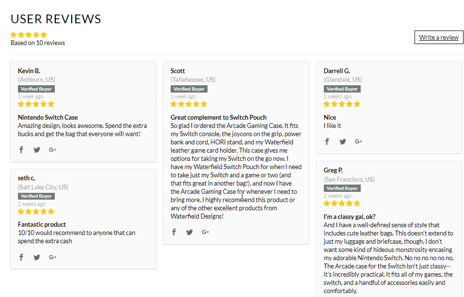
The reviews are well organized and well presented. The headings grab attention.
Reviews also help in search engine optimization.
Want to get reviews like this for your products too? But clueless about where to start?
Send a well-crafted and persuasive email that compels them to leave a review about a product they just purchased.
Just like Sephora:
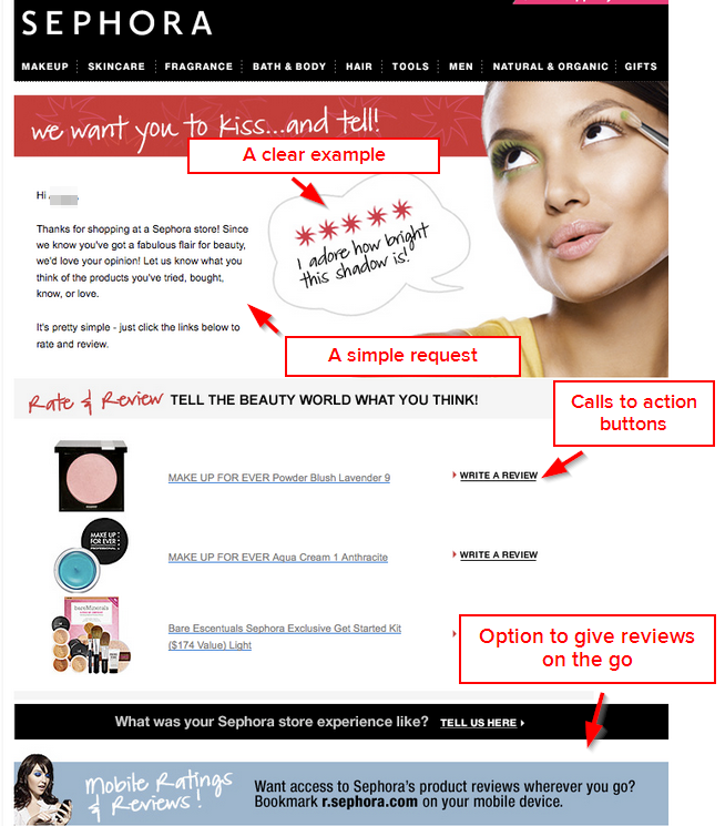
The best time to ask for a review is right after they’ve opened your product. So a day after it was delivered.
The Truth About eCommerce Conversion Killers
As a busy store owner you’ve got more on your plate than you can chew.
There’s inventory management, product quality assurance, shipment, delivery…the list is long.
Plus you’re also in charge of the user experience in your online store. A dropped ball in the flow can lead to leaks in your funnel.
It’s not easy to manage it all. But here’s the thing:
Being aware of the conversion killers is the first step to fixing them.
So put aside some time today- and approach them head on- one at a time.
Good luck.
Get our Conversion Essentials Bundle and fix these conversion killers today.

